

The S&P/ASX 200 holds around 200 companies. Twenty of them are 64% of it.
An adviser who buys the index for a client, or who buys a fund built around it, is buying that concentration whether or not anyone discussed it. The question this article asks is a narrow one: are those twenty companies priced the same way as the other 180?
On the simplest measure available, they are not. And before the argument: our own funds are positioned for this view, so read it knowing that. The Concentrated fund has about 8% in the top twenty, and that sits in two of the twenty companies rather than spread across them. The Income fund's 9% is a net figure: seven of the twenty held outright, the rest held net short through the fund's hedges. The index's own weight is 64%. We are not neutral observers here.

The grey band is the whole argument in one shape: for fifteen years the largest companies were, if anything, slightly cheaper than the rest of the market. The rest of this article is about when that changed and whether it survives being tested.
The measure
Every company's shares trade on a multiple of something — its earnings, or its earnings before interest, tax, depreciation and amortisation. The multiple is just the price divided by that figure, and it moves as sentiment about a company changes, separately from the business itself.
So here is a question that needs no forecast at all: where is each company's multiple today, against the median multiple it has traded on over the past five years?
That is the whole measure. A company trading above its own five-year median multiple is dearer than it has usually been. Below it, cheaper. We use earnings before interest, tax, depreciation and amortisation for sectors where that is the convention and earnings for the rest, we need a complete five years of monthly history for a company to qualify, and 182 of the 201 index lines our data covers have one.
It is deliberately a modest measure. It says nothing about whether a business is good, whether the earnings are durable, or what the shares are worth. It is a description of today's prices against the recent past, which is exactly why it can be published without anyone having to accept a single one of our forecasts.
(The charts below use the price-to-earnings ratio for every company rather than switching measure by sector, so that one line means one thing across twenty years. The two approaches give the same answer today, within about two percentage points on each group.)
What it says
Only three of the top twenty companies trade below their own five-year median multiple. Outside the top twenty, 99 of 162 do.
That is 15% against 61%, on the same measure, on the same day. The median company in the top twenty trades about 8% above its own five-year median multiple; the median company outside it, about 7% below.
Put plainly: the two-thirds of the index concentrated in twenty names is, on the whole, dearer than it has usually been, and the remaining third is not.
Every figure in this article is as at 13 October 2026. The measure is rebuilt each day, so the counts will have moved a little by the time you read this — the gap between the two groups is the finding, not any single day's number, and each chart below carries its own date.
The premium is new
None of that would matter much if the largest companies had always been priced at a premium. They have not.
Over the twenty years to October 2026, the twenty largest companies have traded dearer than the rest in only about half the months — and for most of that period the gap ran the other way. Averaged over five-year blocks, the twenty largest traded at a small discount to the rest: about a third of a turn of earnings cheaper in the five years to 2011, a third again to 2016, and six-tenths of a turn to 2021.
Then it inverted. Since late 2021 the twenty largest have traded at an average premium of about 1.7 turns of earnings, and the last time the twelve-month average gap was negative was January 2022. Today it is 3.1 turns — 17.0 times against 13.8 — which is close to the widest it has been in the twenty years this data covers.
The same picture in the form the article has been using — each company against its own five-year history rather than against each other:
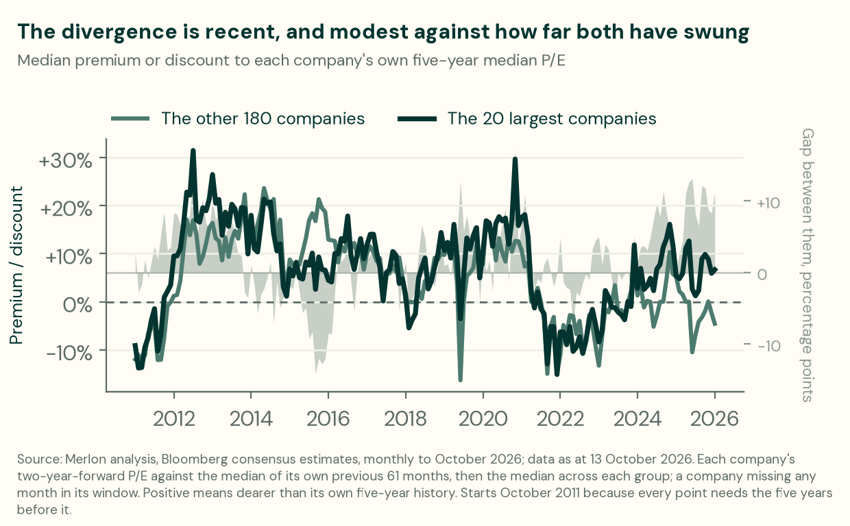
And this is where the honest reading is more careful than the headline. Both groups swing a long way against their own histories — between roughly a 15% discount and a 30% premium — and for most of the past fifteen years they have swung together. The separation at the right-hand edge is real, it is the thing this article is about, and it is recent and moderate against that range. Anyone presenting it as a chasm is overselling it.
What the two charts together say is narrower and more useful than "mega caps are expensive": the largest companies have moved from being priced slightly below the rest of the market to being priced above it, and that change has happened in the last five years.
It is a gradient, not a cliff
The top twenty is an arbitrary line, so the obvious test is whether the pattern depends on it. It does not.
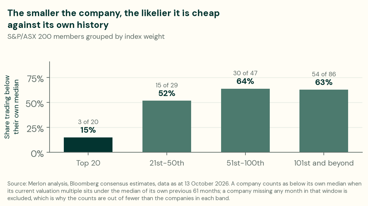

The share rises as company size falls, steeply between the top twenty and the next thirty and then flattening. Drawing the line at twenty is a presentational choice; the gradient underneath it is not.
"That is just banks and miners"
This is the first objection a professional reader should raise. The top twenty is dominated by two sectors, and if those two happen to be dear, the result is a sector observation wearing a size costume.
It is answerable twice over.
Remove both sectors entirely — every bank, every property trust, every miner and every energy company, from both groups. Eight of the top twenty remain, and 77 of the rest. Two of those eight trade below their own median multiple; 50 of the 77 do. The gap is 25% against 65%, which is the same finding with three-quarters of the index taken out of it.
Then look inside each sector, comparing a sector's top-twenty members against that same sector's smaller companies:

In all four, the index's largest members look dearer against their own history than the smaller companies in the same sector. The two-company Financials row and the five- to seven-company rows elsewhere are small samples and should be read as indicative, not as four independent confirmations. But the direction is the same in every one, and that is harder to explain as a sector artefact than as something about size itself.
(Our sector grouping is coarser than the one an adviser will be used to: we run four, which is why "Banks & Real Estate" sits beside a separate "Financials" holding insurers and the rest, and why "Materials & Energy" carries a handful of transport infrastructure businesses alongside the miners.)
Why this might be happening, briefly
We are more confident about the measurement than the mechanism, and the article is better for saying so. Three explanations are commonly offered and all three are plausible:
Index money does not choose. A dollar into an index fund buys 64 cents of those twenty companies regardless of their price. As the share of the market held passively has risen, so has the volume of price-insensitive buying, and it lands in proportion to size.
Size has become a quality proxy. Large, liquid, well-covered companies are easier to own, easier to justify, and easier to sell. That is worth something, and a premium for it is not irrational.
The alternative is harder work. A company outside the top hundred needs original research and cannot be bought in size quickly. The reward for doing that work is what this measure may be describing — which is the argument our colleague Joey Mui made in What's left when the machines take the easy trade?, and this article is the measurement behind it rather than a new claim.
Two more explanations are worth testing rather than asserting, so we tested them.
The top twenty are full of businesses that ought to be cheap, and always have been. Resources and energy companies — the miners and energy producers, not the transport infrastructure businesses that sit in the same group in our own sector classification — are capital intensive; banks are leveraged. Both are reasons to pay less for a dollar of their earnings, and the market does: measured on the same two-year-forward basis, resources and energy have traded at a discount to industrials and non-bank financials in 228 of the past 241 months, by as much as twelve turns of earnings, and banks in 240 of them. The exceptions are not scattered through the record — they run from late 2007 to the middle of 2010, the commodity boom and the crisis that followed it. Ten of today's top twenty sit in those two groups, and they are 43 of the index's 64 percentage points. That explains the old discount rather than the new premium — the composition has not changed, and the same group that was cheap for structural reasons is now dear despite them. It makes the inversion harder to explain, not easier.
Earnings expectations are not what moved. The most innocent explanation for a re-rating is that the companies simply got better: if consensus earnings for the largest companies had been climbing faster than for the rest, a higher multiple would need no further story. They have not. Over the five years in which the premium opened, the median top-twenty company's two-year-forward consensus earnings rose 24.7% against 39.7% for the other 180 — fifteen percentage points slower. Over ten years the gap is wider still, and over three years the two are level. Whatever the market has been paying up for, it is not faster expected earnings.
What this does not tell you
A low multiple is not the same as a cheap company. A company's multiple can fall below its own history because the business has genuinely deteriorated — a structural decline, a lost contract, an earnings base that will not repeat. This measure cannot tell the difference between a stock the market has mispriced and one it has correctly re-rated. That judgement is the actual work, and it is not in this number.
It is backward-looking twice over. The benchmark is the company's own past five years, so a company that spent that period expensive looks cheap on a return to merely dear. And five years ends when it ends: a different window gives different answers.
It says nothing about when, or whether, anything resolves. A multiple below its own median can stay there for years, or go lower.
It is a photograph of one day. The underlying data is rebuilt daily, and the figures here were taken on 13 October 2026. A count of how many companies sit below their own median moves with the market; the pattern it describes has taken five years to build and does not.
The twenty-year charts describe today's largest companies, not the past's. The twenty are ranked by their index weight today and carried backwards, so a company is in that group because of what it has since become. A chart of the companies that were largest in 2006 would be a different chart, and we do not have the history of index weights to draw it. Coverage thins going back as well: 172 of the other 180 have a usable figure today against 76 twenty years ago, so the early years describe a smaller and longer-surviving set of companies.
Nineteen companies have no figure, because our rule needs a complete five years of monthly history and discards the whole measure if a single month is missing. That is deliberately strict, and it means the counts above describe 182 of the 201 index members rather than all of them.
There are good reasons to hold large companies. Liquidity, dividend franking, lower trading costs and the ability to put money to work at scale are real, and for many clients they matter more than a multiple. Nothing here says the top twenty should not be owned — only that owning them at 64% is a decision, and one worth making deliberately rather than by default.
And we are not disinterested. The Concentrated fund has about 8% in the top twenty against the index's 64%, concentrated in two names; the Income fund about 9%, net of its hedges. If this pattern reverses, we are wrong and our clients will feel it.
How to use it
- Find out what share of your client's Australian equity exposure sits in the top twenty. For an index fund it is about 64%. For an active fund, ask — many are closer to the index than their fee implies.
- Ask a manager what they think of each of the largest few positions in the index, not as a quiz but because the answer tells you whether they have a view or a tracking error budget.
- Treat a single valuation measure as a question, never an answer. This one points somewhere; it does not establish that the somewhere is right.
- Ask who is doing the work outside the top hundred, and what it costs. That is where this measure says the dispersion is, and it is also where research is hardest to come by.
The index is a decision about where two-thirds of a client's money goes. It is worth knowing that the decision was made by market capitalisation rather than by anybody's judgement about value.
.jpg)