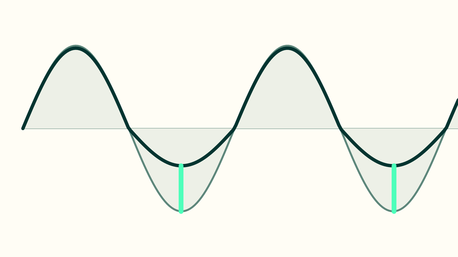

Two numbers describe the shape of a fund's return rather than its size. Upside capture is how much of the market's gains a fund collected in the months the market rose. Downside capture is how much of the market's falls it took in the months the market fell.
Most fund reviews quote one of them. Quoting one is how a fund that gave up its upside to buy a low downside number looks like a fund that protected capital, and the two are not the same thing at all.
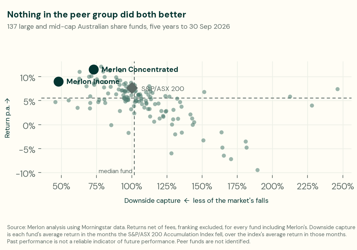
Every large and mid-cap Australian share fund with a five-year record, plotted on the two things a client actually feels: what they earned, and how much of the market's falls they sat through. The rest of this article is how to read that picture, and what it does not tell you.
What each number is
Over the five years to 30 September 2026, the S&P/ASX 200 Accumulation Index fell in 23 of 60 months and rose in the other 37.
Downside capture is a fund's average return across those 23 falling months, divided by the index's average return across the same 23 months. Upside capture is the same calculation over the 37 rising months. Below 100% downside capture means the fund fell by less than the market; above 100% upside capture means it gained more.
Two properties of the arithmetic matter to anyone reading these numbers.
They are ratios of averages, not percentages of anything. A capture ratio can exceed 100% and it can be negative. Two funds in our comparison have a negative downside capture, one at −8% and one at −9%: on average, both rose in the months the market fell. That is a real result and the metric handles it; a number described as "the percentage of the fall captured" would not.
They depend on which index, and over what period. The months counted are the months the index fell, so a different index gives a different set of months and a different answer. Any capture figure without its benchmark and its window beside it cannot be compared with another one.
Why one number is not enough
Here is the problem with downside capture read alone. Across the 137 large and mid-cap Australian share funds with a full five-year record, the median fund captured 102% of the market's downside and 93% of its upside. That is roughly what the index does, slightly worse — which is what you would expect of a group of funds holding mostly the same shares as the index.
Now consider how a manager could improve on that single number. Holding 20% cash lowers downside capture immediately. So does a permanent tilt to defensive sectors. Both work, both are legitimate, and both cost upside in the same motion. A fund with 60% downside capture and 60% upside capture has not protected anybody from anything — it has just held less of the market, and a client could have done that themselves for a fraction of the fee.
The spread between the two is where the information is. Upside capture minus downside capture asks whether a manager kept the gains while avoiding the falls, which is the only version of the question a client would recognise. It is also far harder to manufacture: cash and defensive tilts move both numbers together, so a wide spread has to come from the portfolio itself.
A worked example
Our two funds, measured the same way as the field: against the S&P/ASX 200 Accumulation Index, over the five years to 30 September 2026, on returns net of fees and excluding franking credits.
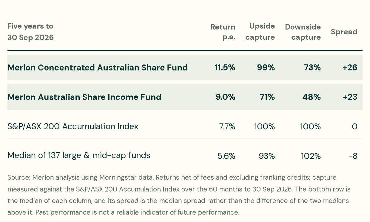
Past performance is not a reliable indicator of future performance. Returns are net of fees and exclude franking credits; capture ratios are measured against the S&P/ASX 200 Accumulation Index over the 60 months to 30 September 2026. Each figure in the bottom row is the median of that column across the 137 funds, and the spread shown is the median spread rather than the difference between the two medians above it. Source: Merlon analysis using Morningstar data.
Three things are worth reading from it.
The Concentrated fund kept essentially all of the upside. 99% upside capture with 73% downside capture is the combination the spread is meant to find: the fund was not sitting out of the market to achieve a lower downside number.
The Income fund has the second-lowest downside capture of the 137, and the fund below it proves the point of this article. Exactly one fund in the group took less of the market's falls — 46% against Income's 48%. It also captured only 51% of the market's rises against Income's 71%, giving it a spread of +5 against +23, and it returned 4.7% a year against 9.0%. Two funds, both with a low downside capture number; one of them kept the gains. The two need not have the same objective, and this is not a criticism of a manager doing what it set out to do — but they sit in the same peer group, and an adviser screening that group on downside capture alone would have ranked them the wrong way round.
The Income fund's 71% upside capture is still the figure that tells you what its own protection cost. The fund pairs its share portfolio with a yield and hedge overlay, so a lower downside number is partly deliberate design rather than stock selection, and the upside figure is where you see the price of it.
The median fund's spread is negative, and so is the spread of 98 of the 137. The typical large and mid-cap Australian share fund took more of the market's falls than it captured of its rises.
Two benchmarks answer two different questions
The Income fund's own benchmark is not the ASX 200. Its product disclosure statement names a blend — 70% S&P/ASX 200 Accumulation Index and 30% Bloomberg AusBond Bank Bill Index — because the fund deliberately runs about 30% less market exposure than a pure equity portfolio.
That gives two honest readings of the same fund, and they answer different questions:
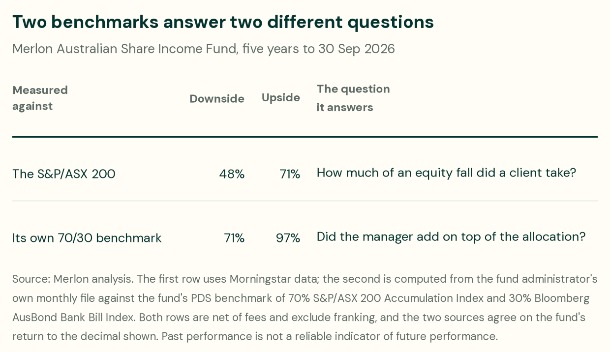
Both belong in front of an adviser. The ASX 200 row is the client's experienced outcome, and it is the comparison advisers make whatever a product disclosure statement says. The second row is the one that explains why, and it is the more demanding test: measured against its own mandate, the fund still cut nearly a third of its benchmark's falls — 71% against the benchmark's 100% — while keeping 97% of its rises. That is the manager's contribution with the asset allocation taken out of it, and it is a much smaller number than the ASX 200 row because the benchmark itself already holds 30% in cash.
Both rows are on the same basis: net of fees, franking excluded, 60 months to 30 September 2026. The second is computed from the fund administrator's own monthly file rather than from Morningstar, and the two agree on the fund's return to the decimal shown, which is what makes putting them in one table legitimate.
Give only the 48% and a careful adviser should ask whether the manager is taking credit for holding less equity. Give both and the answer is on the page.
What must never happen is mixing them. The two readings above describe the same fund over the same period against different yardsticks, and they are far apart. Every capture number needs its benchmark on the same line as the number — which is the discipline this whole lesson is about, so we apply it to ourselves here.
The comparison that makes the point
Of the 137 large and mid-cap Australian share funds with a full five-year record to 30 September 2026, not one beat the Merlon Concentrated fund on both return and downside capture. Several returned more. Several fell less. None did both.
Nothing in the group beat the Income fund on both measures either: the single fund that took less of the market's falls returned 4.7% a year against Income's 9.0%.
Widen the comparison to all 212 Australian share funds with a five-year record and six beat Concentrated on both counts.
None of those six is a large or mid-cap Australian share fund — four are resources funds, and not one of them appears in the large and mid-cap peer group Morningstar classifies the other 137 into. That is the point of a peer group rather than a caveat to it. A resources fund and a large-cap share fund do different jobs in a client's portfolio, and comparing their capture ratios compares two different market exposures rather than two managers. It cuts both ways: it is also why we quote the large and mid-cap group as our comparison and tell you we have done so.
What these numbers do not tell you
They say nothing about the depth of a fall. Capture ratios average monthly returns. A fund that was down 40% at its worst point and recovered can show a respectable downside capture. Maximum drawdown is the measure for that question, and it is a different one.
A month is an arbitrary unit. The months counted are calendar months in which the index closed lower. A fall that begins mid-month and ends mid-month the next is spread across two months by this arithmetic, and a fund's behaviour within a month is invisible to it.
The window matters, five years is a choice, and here is what the other one looks like. We use five years because it is long enough to contain more than one market environment and because it describes how these portfolios are run today. But an article telling advisers to test a manager's window cannot then decline to show its own, so:
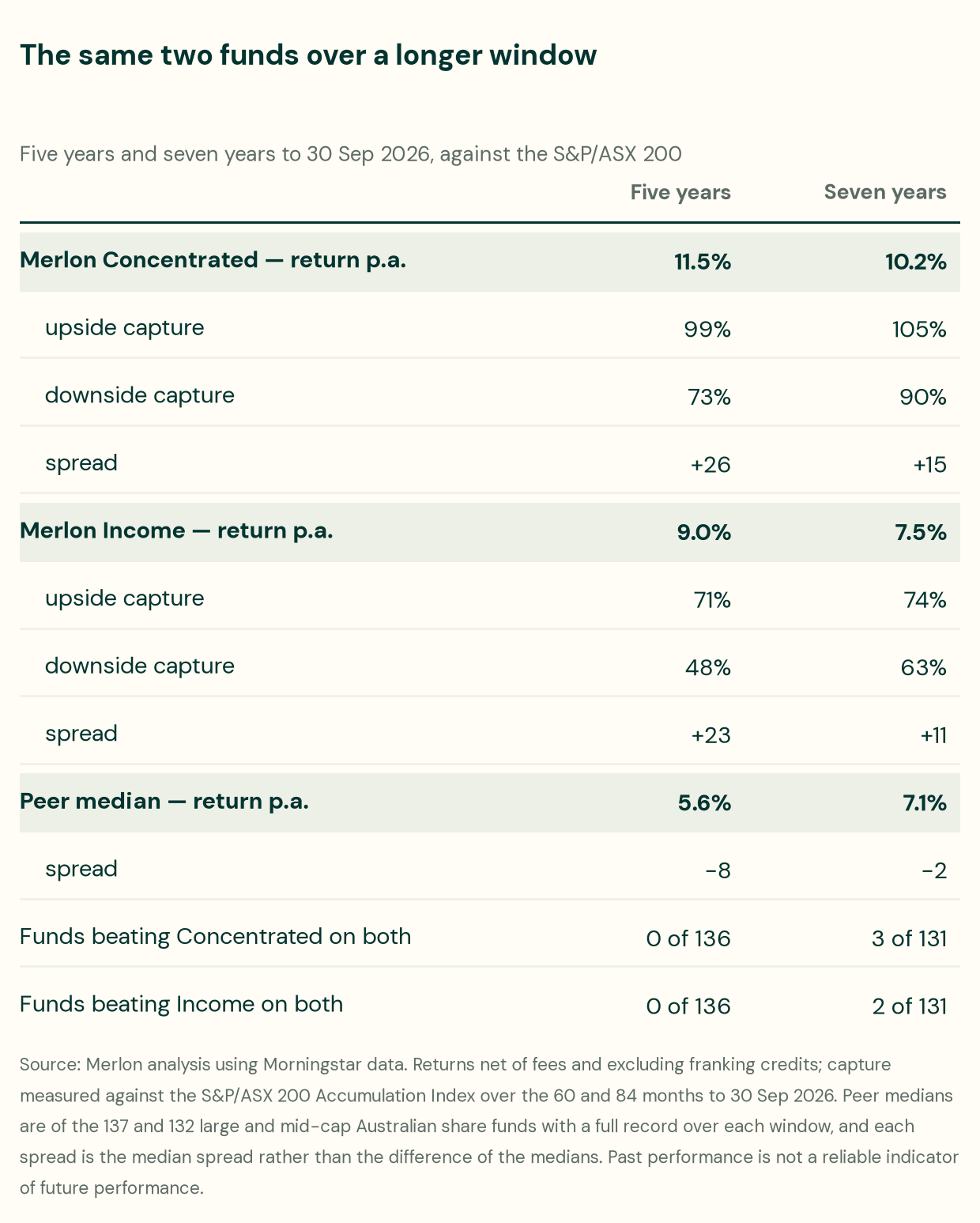
Seven years is less flattering to us, on every line. Both funds took more of the market's falls, both spreads roughly halve, and the claim above — that no large or mid-cap fund beat Concentrated on both return and downside capture — becomes three of 131. Two funds beat Income on both. The peer group's own median spread improves too, from −8 to −2, so part of this is the window and not us.
Why we still quote five. The seven-year window reaches back to the Covid period, before material enhancements to our process, and the changes are specific rather than a general claim to have improved:
- An explicit margin of safety in how stocks are ranked, factoring the downside to our low case directly. It used to be captured subjectively, through conviction.
- Risk reporting rebuilt and integrated into the daily model portfolio framework rather than sitting beside it.
- The engagement programme — the letters to company boards described in our Aurizon piece, which began in this period and did not exist before it.
- A strengthened investment team.
That is an explanation and not a defence, and the distinction matters. Every manager whose longer record is worse has a reason why the longer record is unrepresentative, and a reader has no way to tell a real process change from a story told after the fact. What a reader can do is hold the manager to the standard this article has been arguing for all along: pick one window, state it, apply it to every fund — including ours, and including the window where our own answer is less flattering. Both of ours are above.
Capture ratios are backward-looking and say nothing about why. Two funds with identical capture ratios can have reached them by entirely different routes, one repeatable and one not. The numbers tell you the shape of what happened; they do not tell you whether the manager meant it.
And none of this is a return forecast. A fund that captured less of the market's falls over one five-year period may capture more of them over the next.
How to check a fund yourself
- Ask for both numbers. A downside capture figure with no upside capture beside it cannot distinguish a manager who protected capital from one who simply held less of the market.
- Work out the spread, and compare it against the peer group's rather than against zero.
- Check the benchmark and the window, and make sure they are the same for every fund you compare. Ask which index, over what period, and on what basis — net or gross of fees, franking in or out.
- Ask how the downside number was achieved. Cash, a defensive tilt, a derivative overlay and stock selection all produce a lower figure, and they are not equivalent — the overlay in our own Income fund is exactly why its two numbers must be read as a pair.
- Ask for maximum drawdown too, because capture ratios will not show you the worst moment.
The question worth asking is not "how much of the fall did this fund avoid?" but "what did avoiding it cost in the rises?"
.jpg)